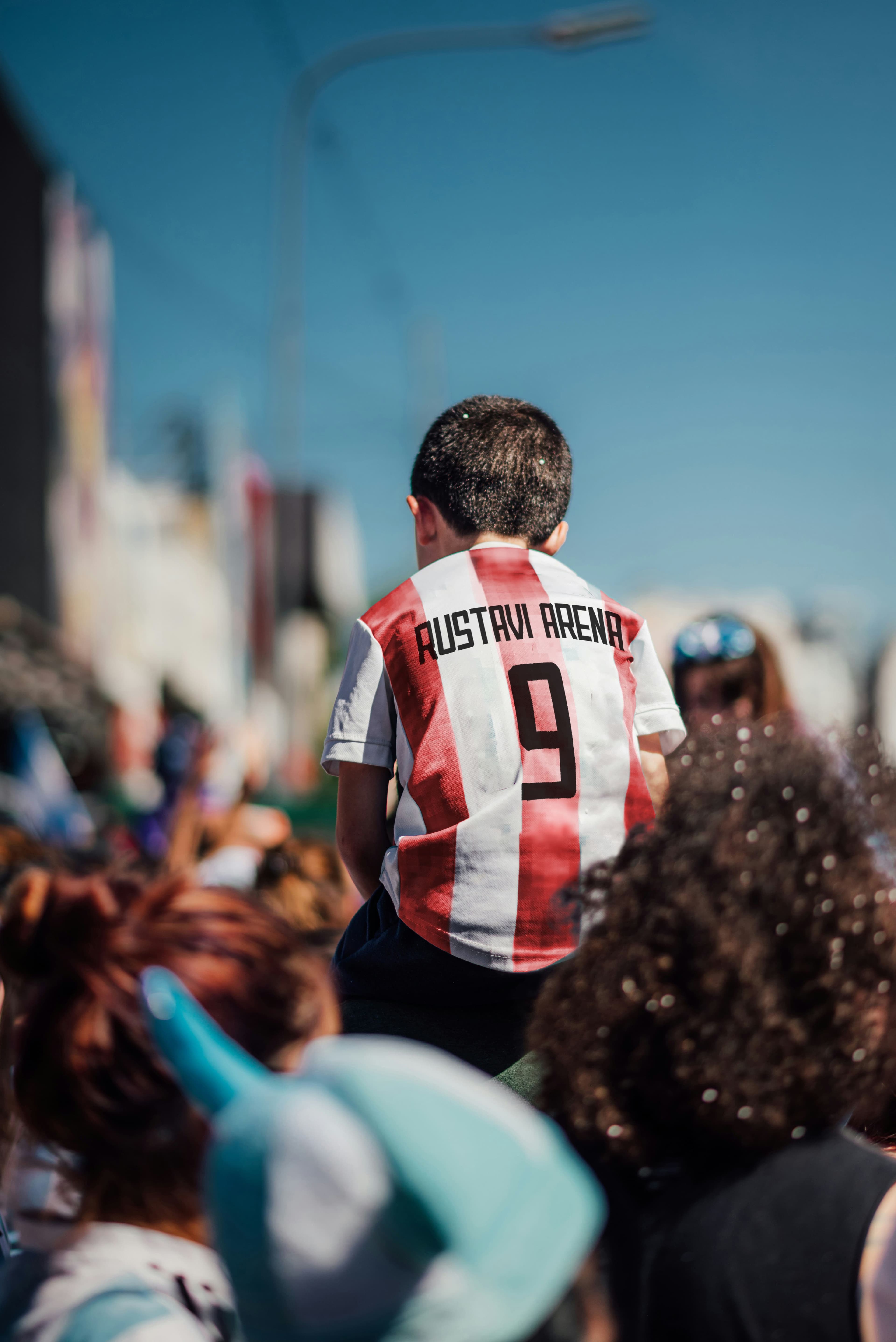
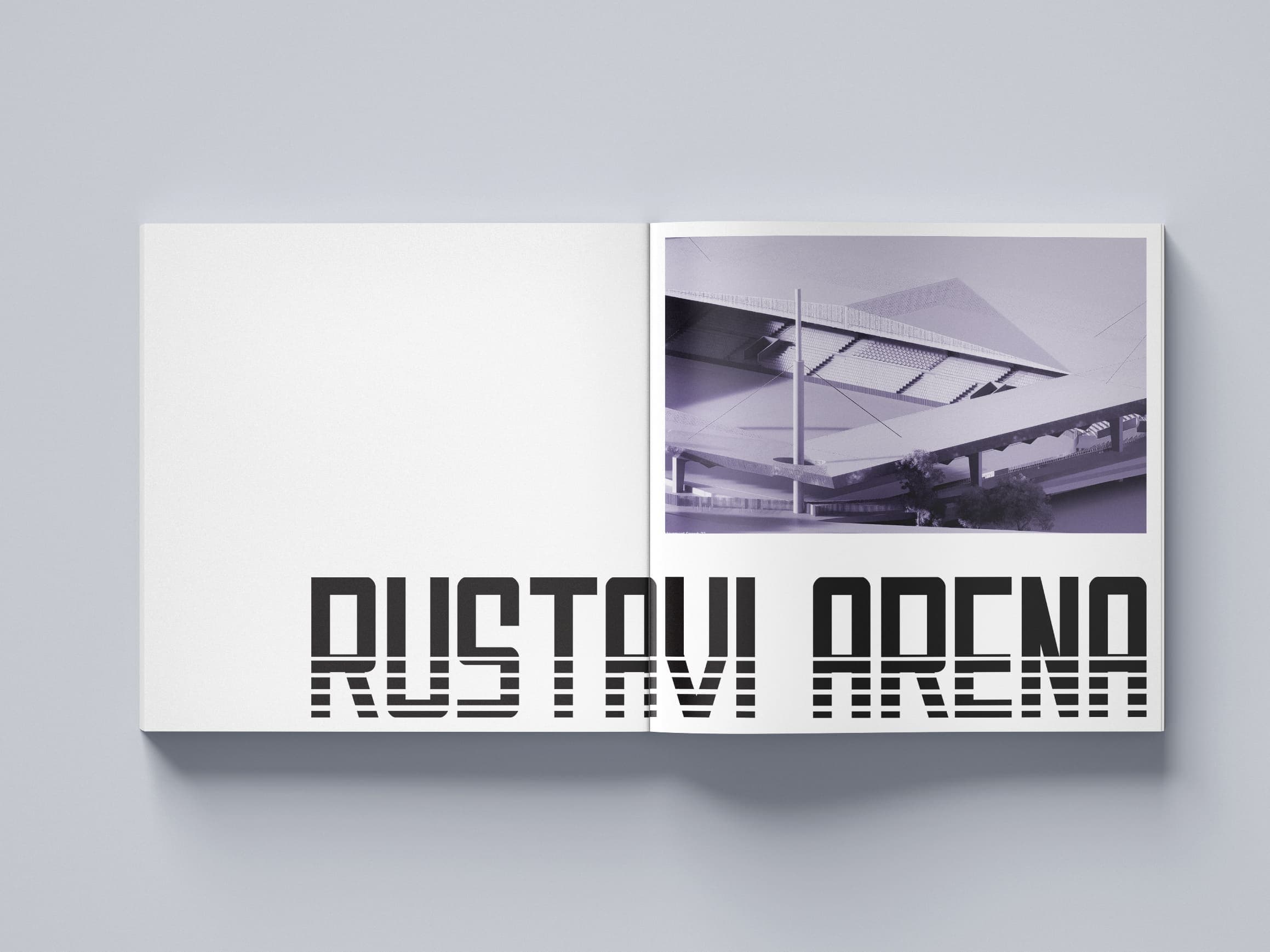
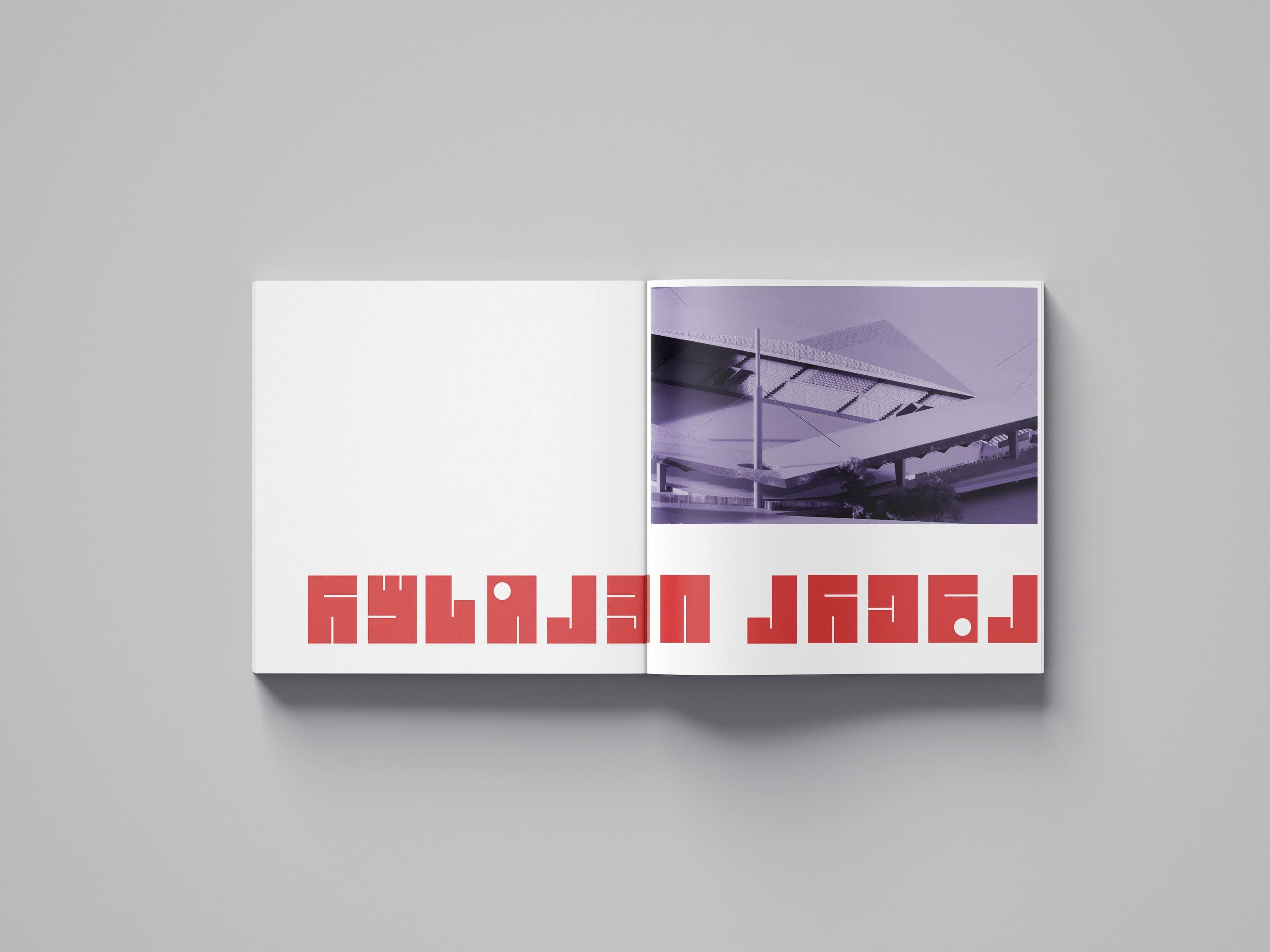
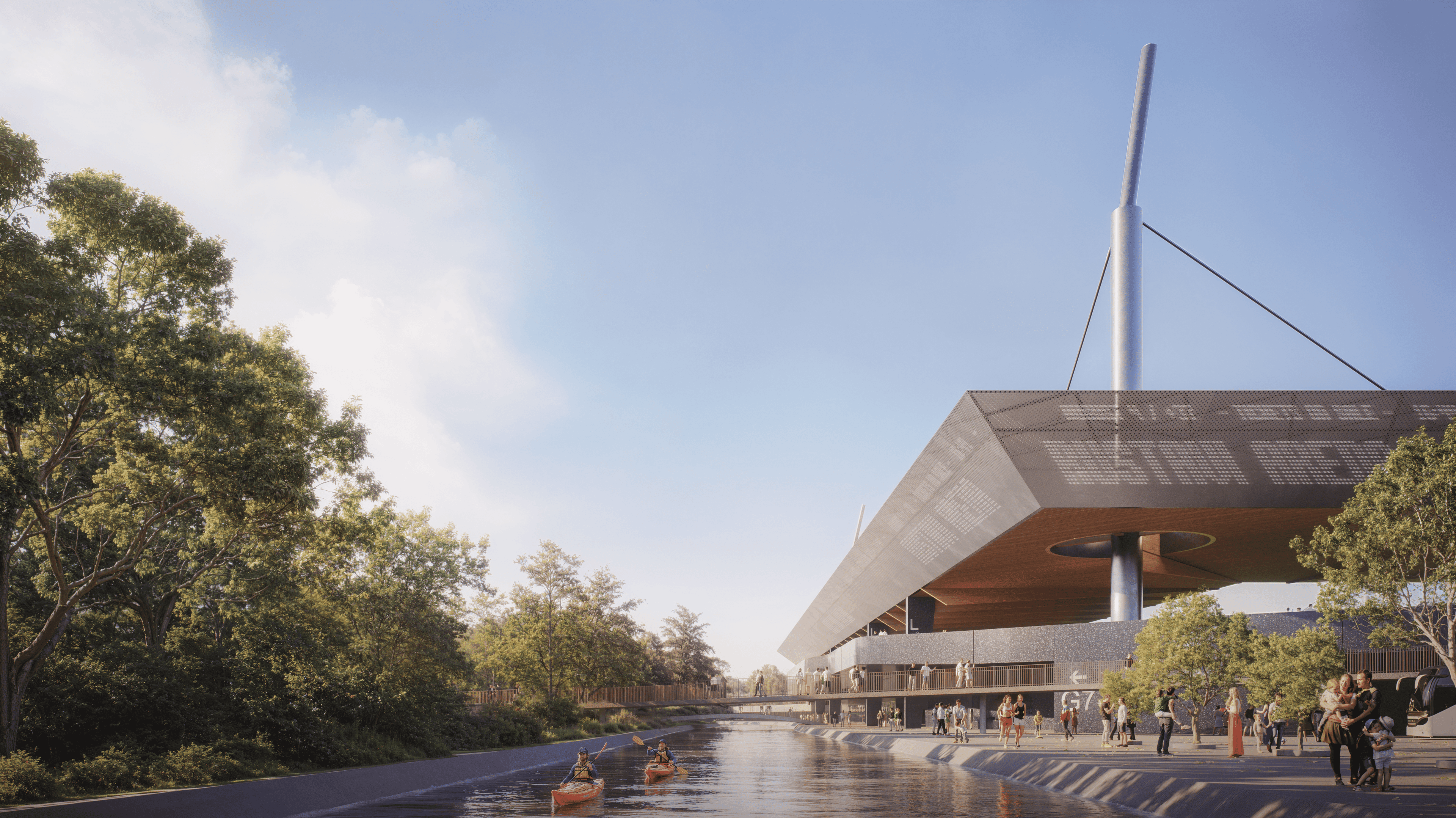
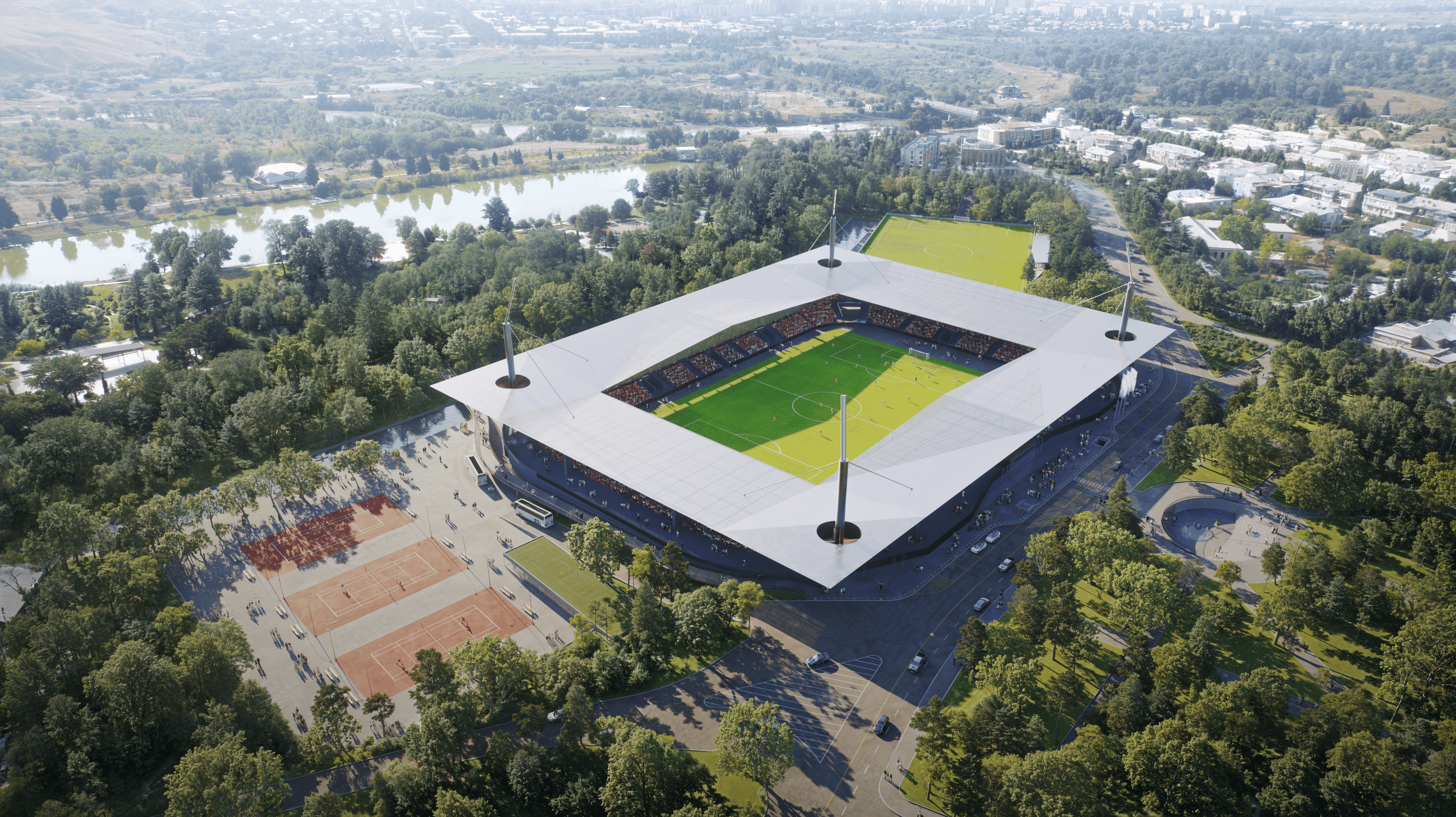
RUSTAVI ARENA
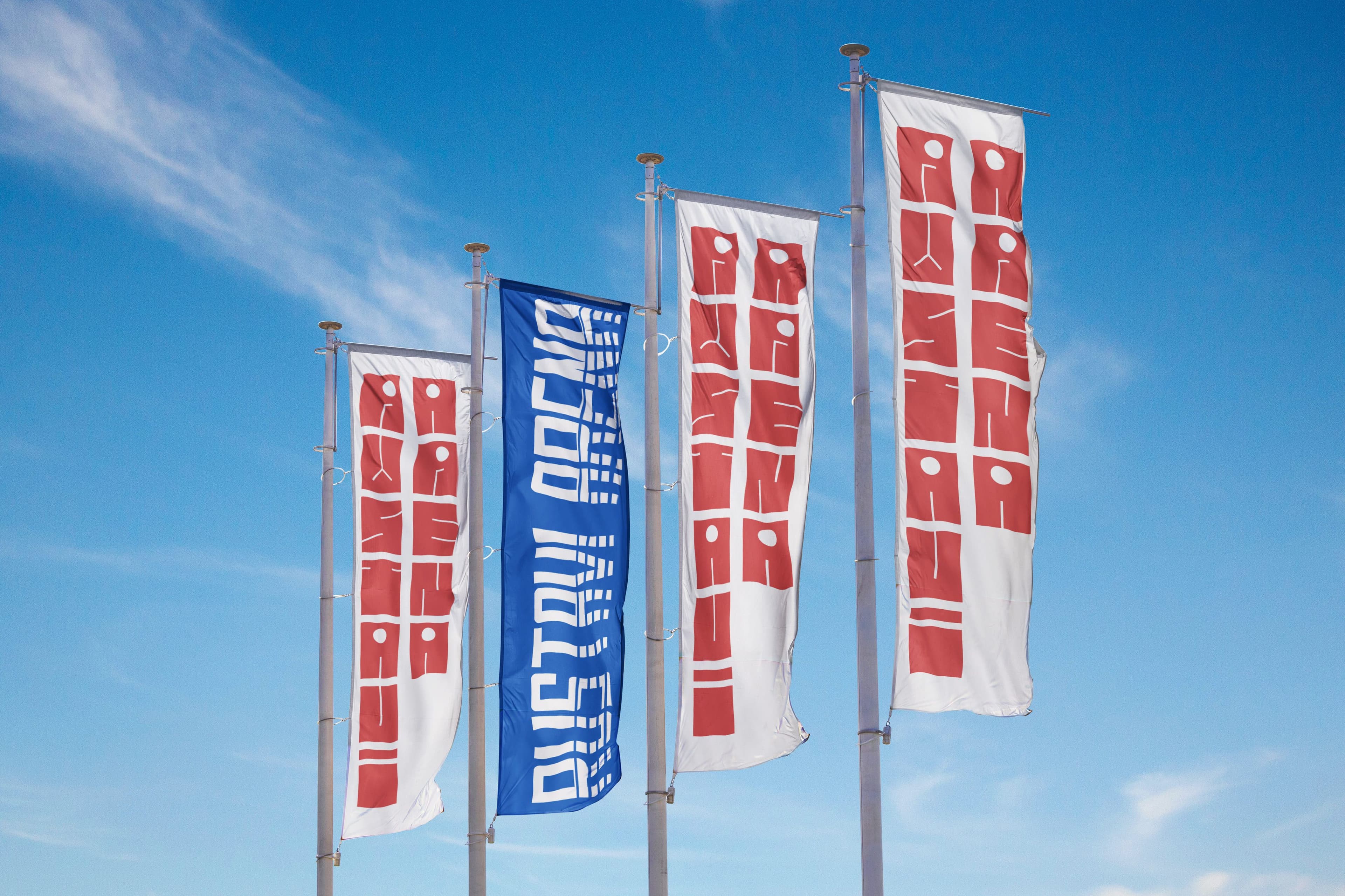
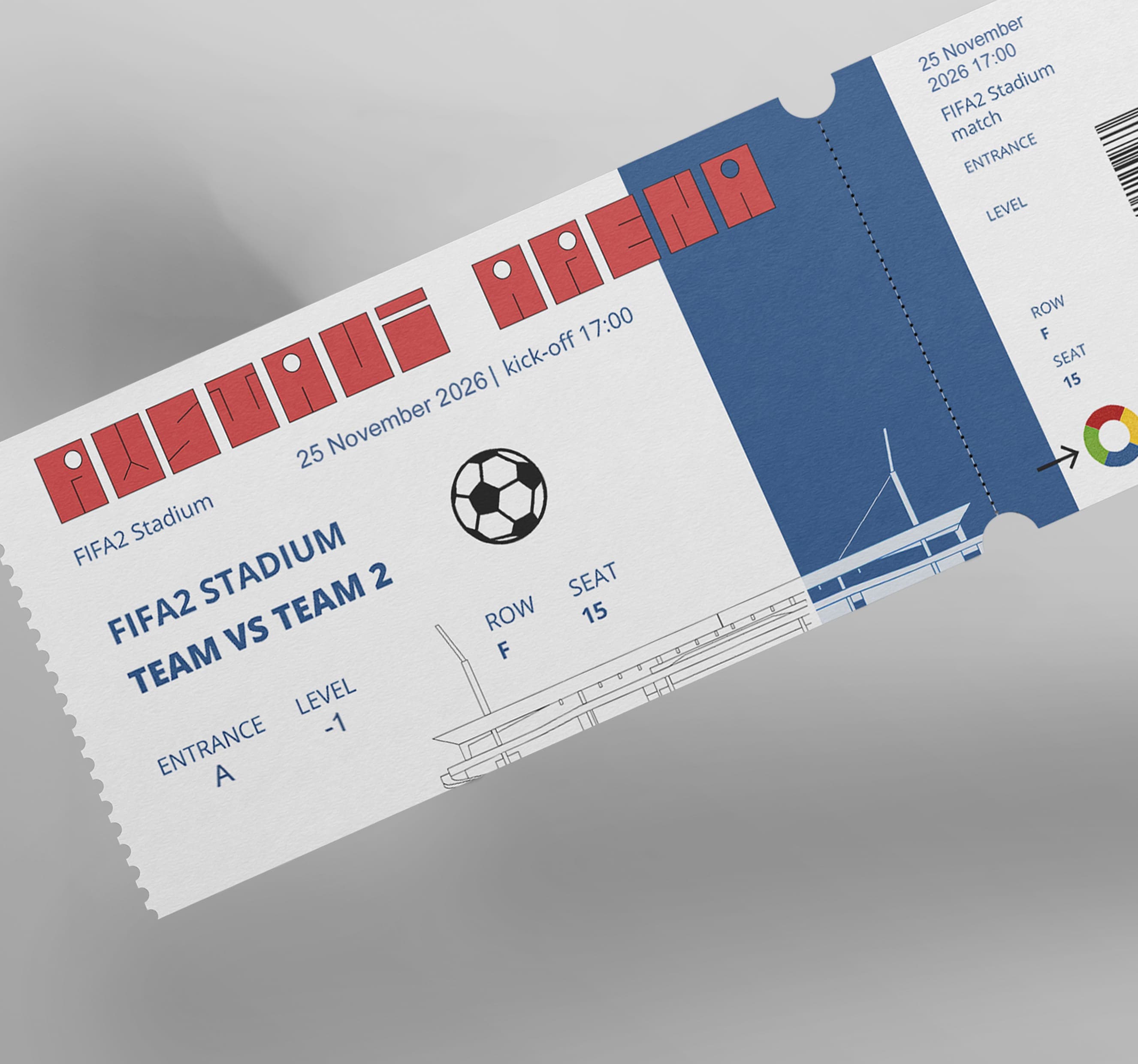
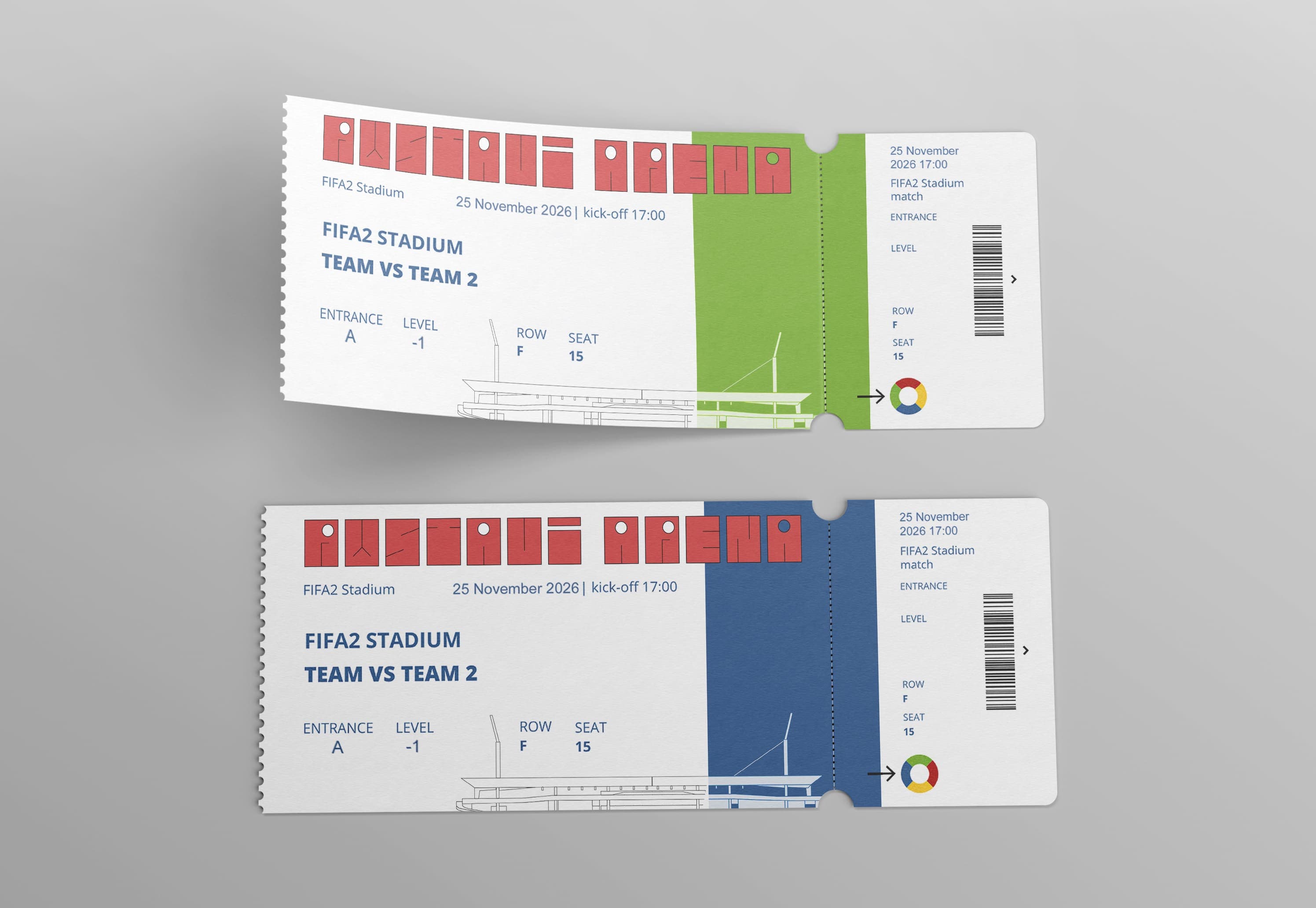
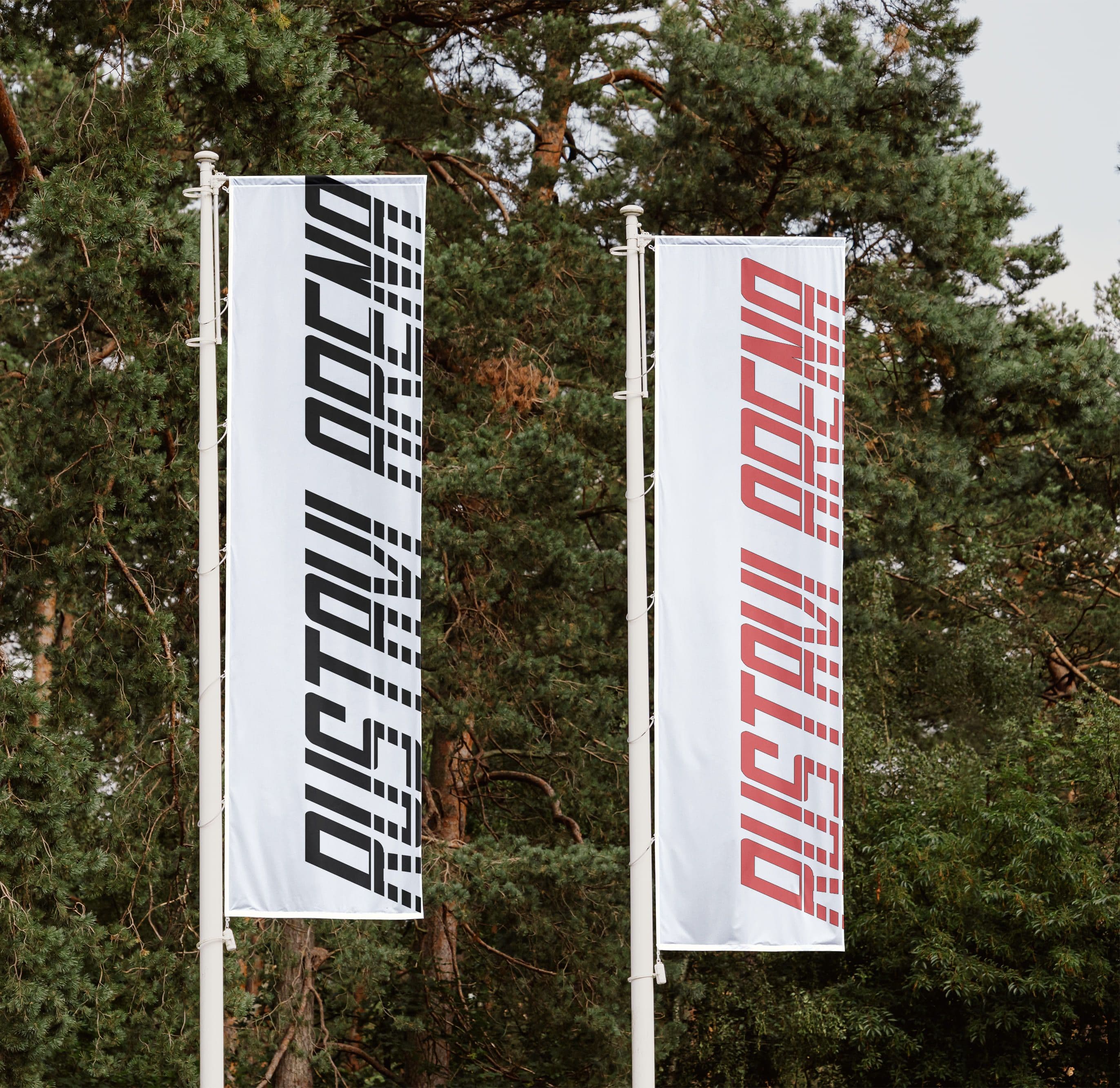
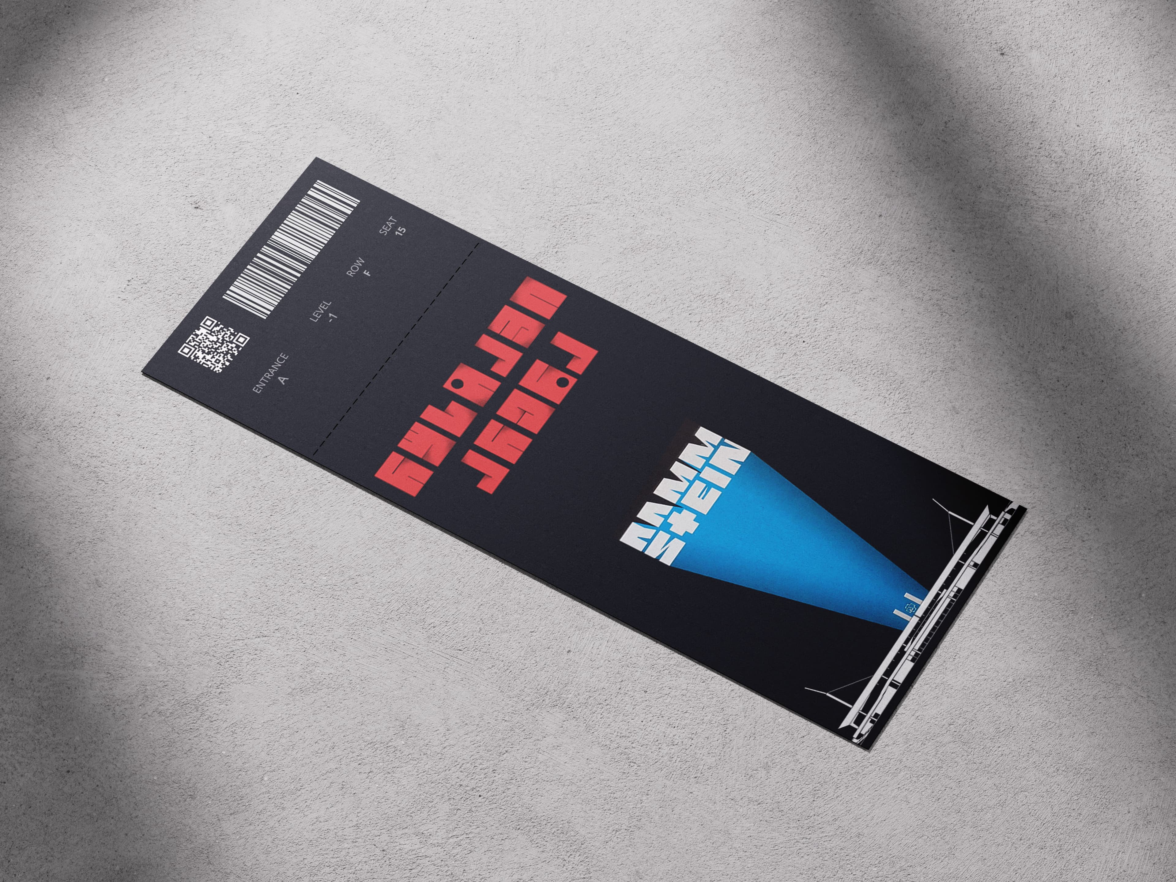
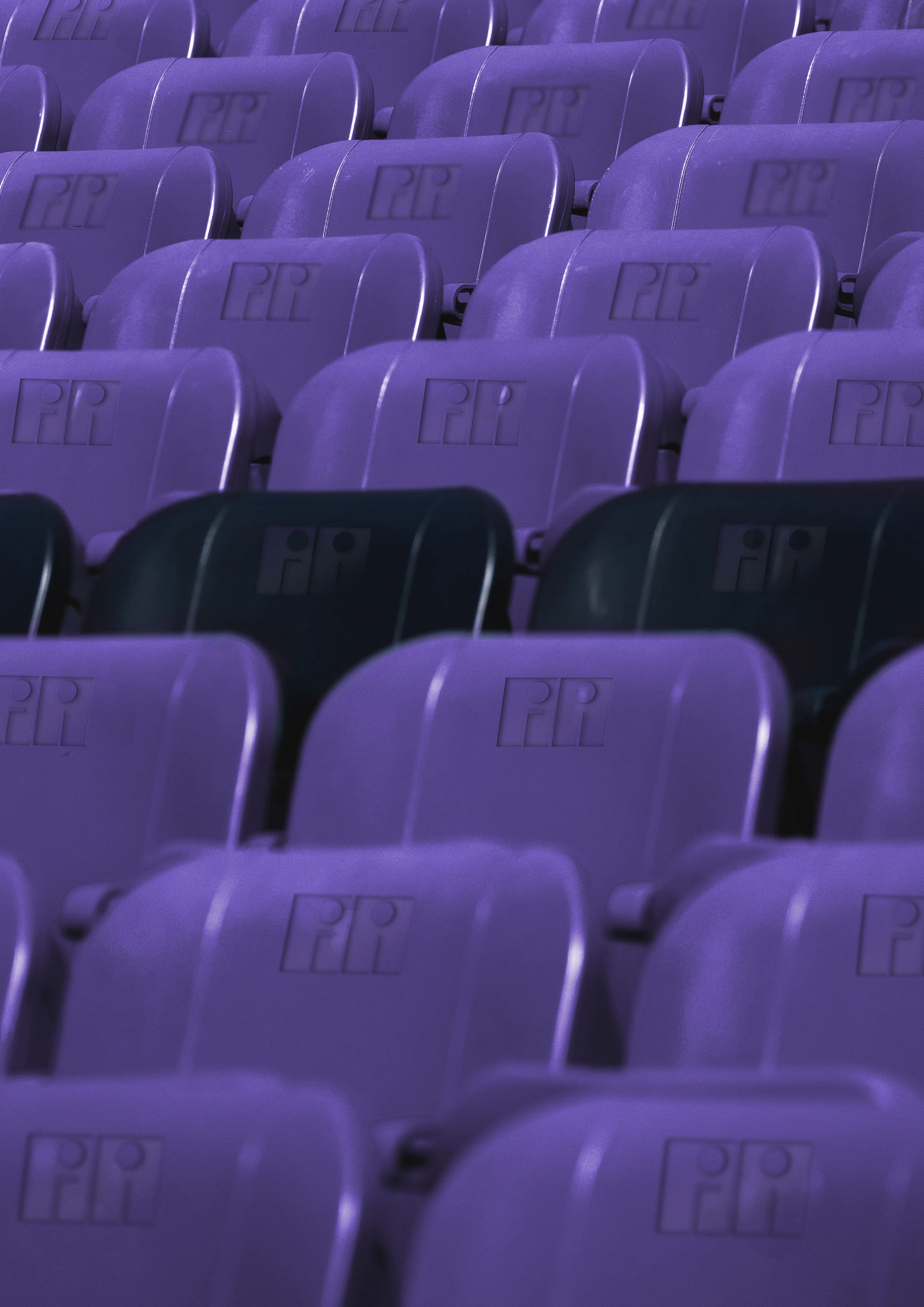
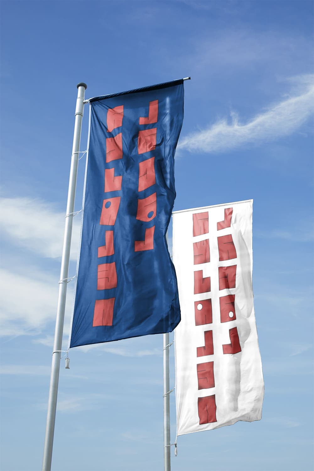
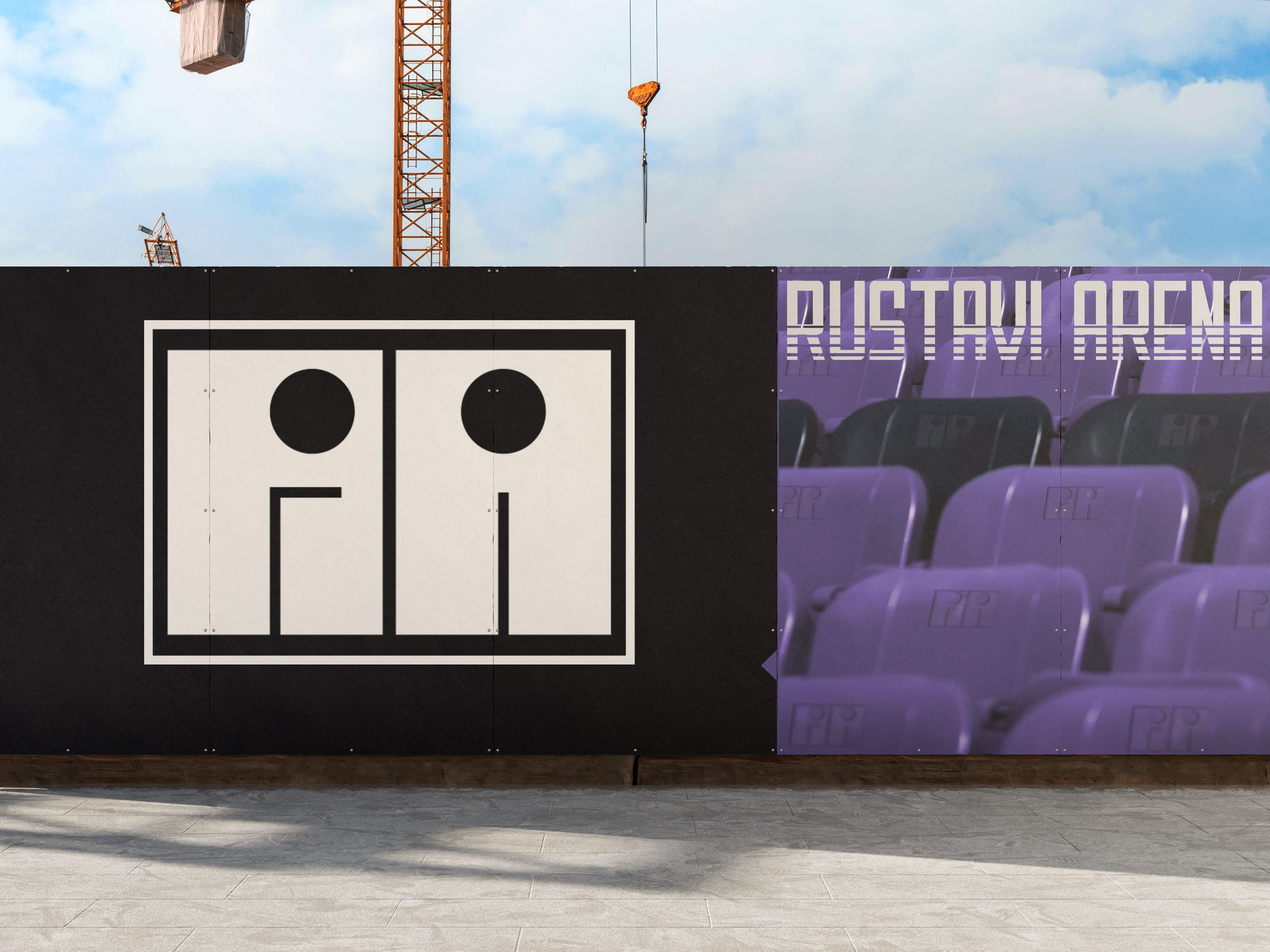
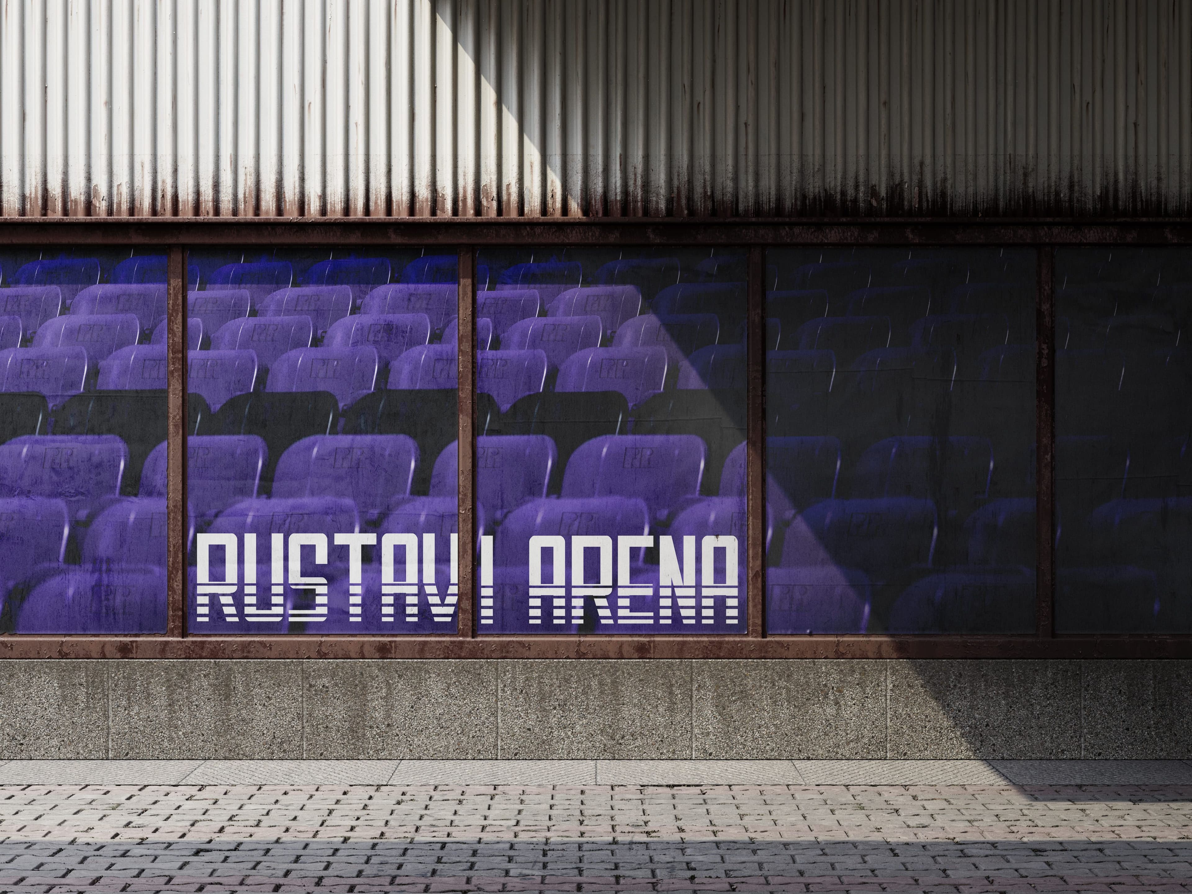
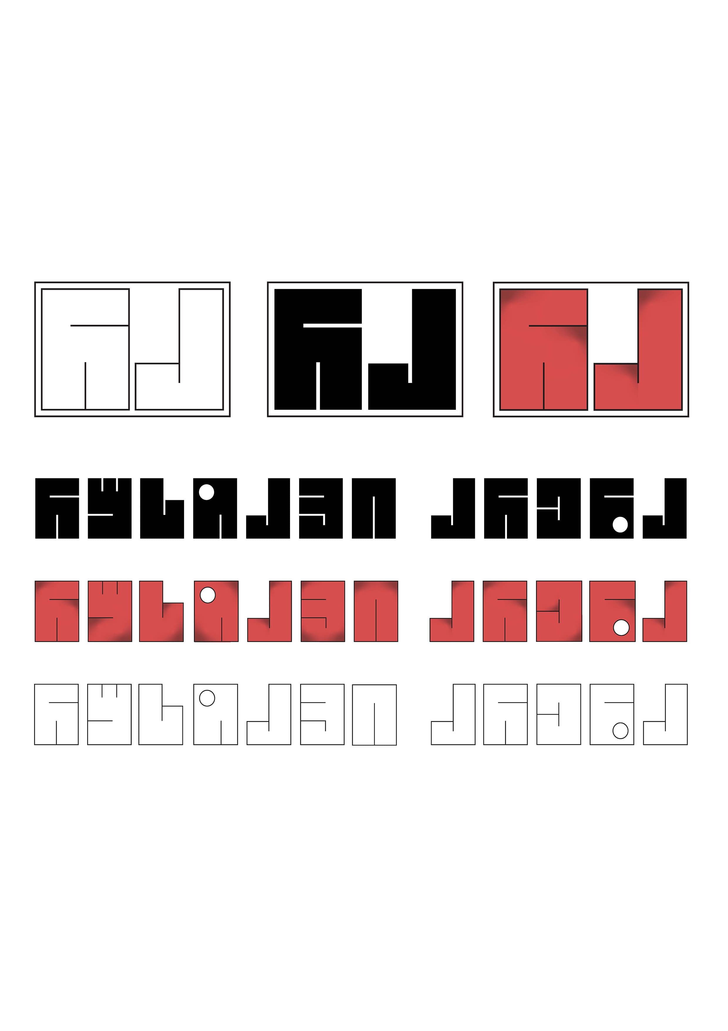
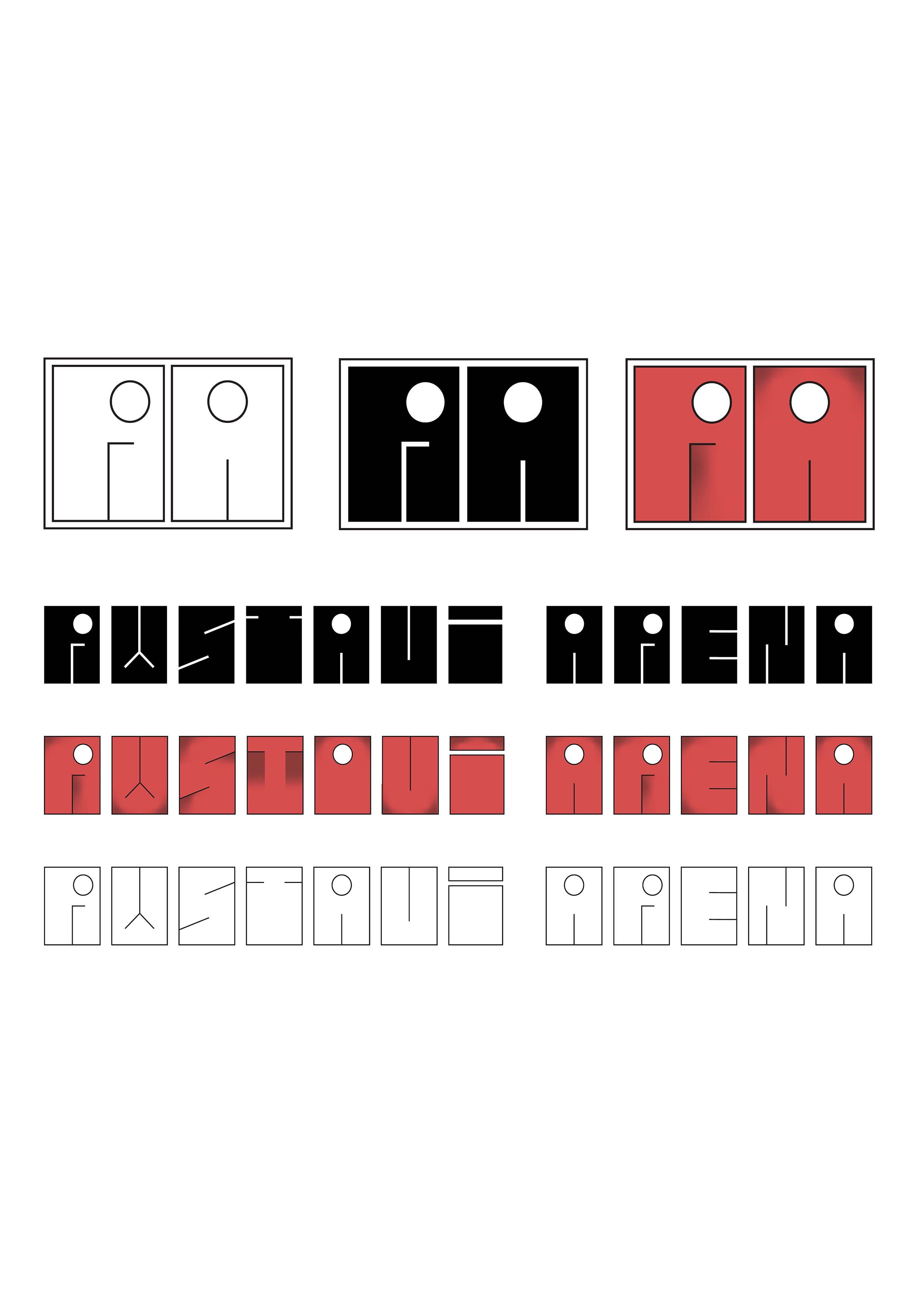
A competition was announced for the reconstruction of Rustavi Arena, with one of the key requirements being the development of a comprehensive brand book covering all core aspects of the stadium’s visual identity. Typography Concept As part of the identity system, two custom typefaces were designed for Rustavi Arena. The primary typeface serves as the corporate font. It is characterized by high legibility, strong readability, and a dynamic, sporty tone. Designed through a contemporary interpretation of the old Rustavi Stadium’s visual language, its sharp forms and energetic rhythm make it suitable across all applications from wayfinding to merchandise. The type family also includes two expressive variations, created for more emotional, event-driven communication. The secondary, decorative typeface is inspired by the architectural concept of Rustavi Arena proposed by NS Studio. Its proportions are derived from the geometry and modular structure of the arena’s roof, resulting in a system that feels both structured and visually distinctive. The character of the letterforms is shaped by angular cuts and circular elements taken directly from the architecture. Logo Concept The stadium symbol (logo) is directly derived from the decorative typeface. It is constructed from the forms of its initial letters and preserves the architectural character of the type system, ensuring strong conceptual consistency across the identity.